E-commerce Dashboard
Custom Solutions
/
SaaS Design
E-commerce Dashboard
Custom Solutions
/
SaaS Design
E-commerce Dashboard
Custom Solutions
/
SaaS Design
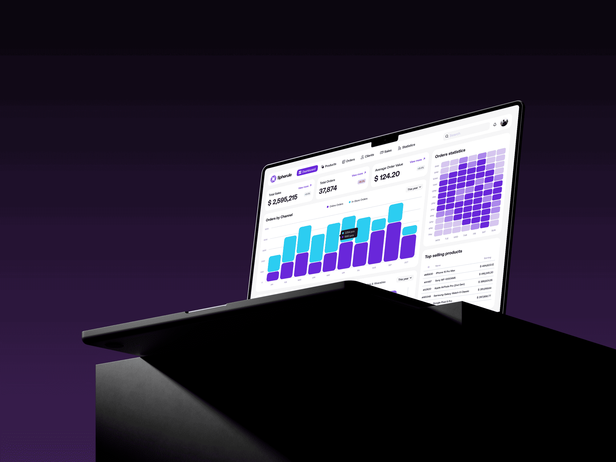
I designed a clean, data-rich dashboard for e-commerce analytics. The focus was on creating a highly scannable interface that surfaces the most critical sales and order metrics to facilitate quick, informed business decisions.
I designed a clean, data-rich dashboard for e-commerce analytics. The focus was on creating a highly scannable interface that surfaces the most critical sales and order metrics to facilitate quick, informed business decisions.
I designed a clean, data-rich dashboard for e-commerce analytics. The focus was on creating a highly scannable interface that surfaces the most critical sales and order metrics to facilitate quick, informed business decisions.
Year
2025
Client
[Confidential]
Industry
E-commerce
Product Duration
3 Weeks
Challenge
Challenge
E-commerce data is often overwhelming, presented in dense spreadsheets or cluttered interfaces. The challenge here was to cut through that noise. I needed to design a dashboard that transforms raw sales data into a clear, scannable, and actionable tool.
The goal was to move beyond just displaying numbers and instead create a single source of truth where key performance indicators and trends are immediately visible, allowing users to understand business health at a glance.
Information Architecture
Information Architecture
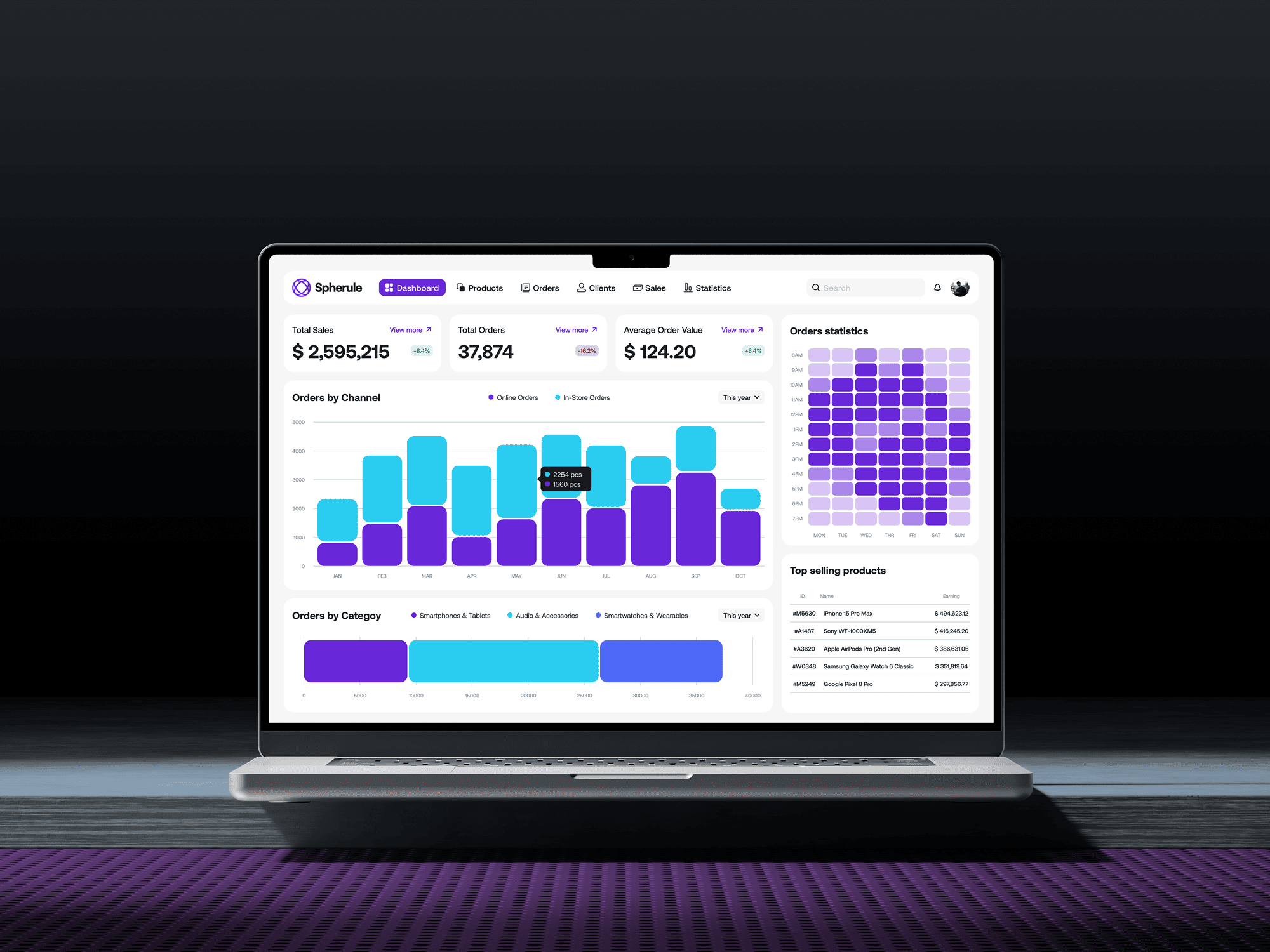
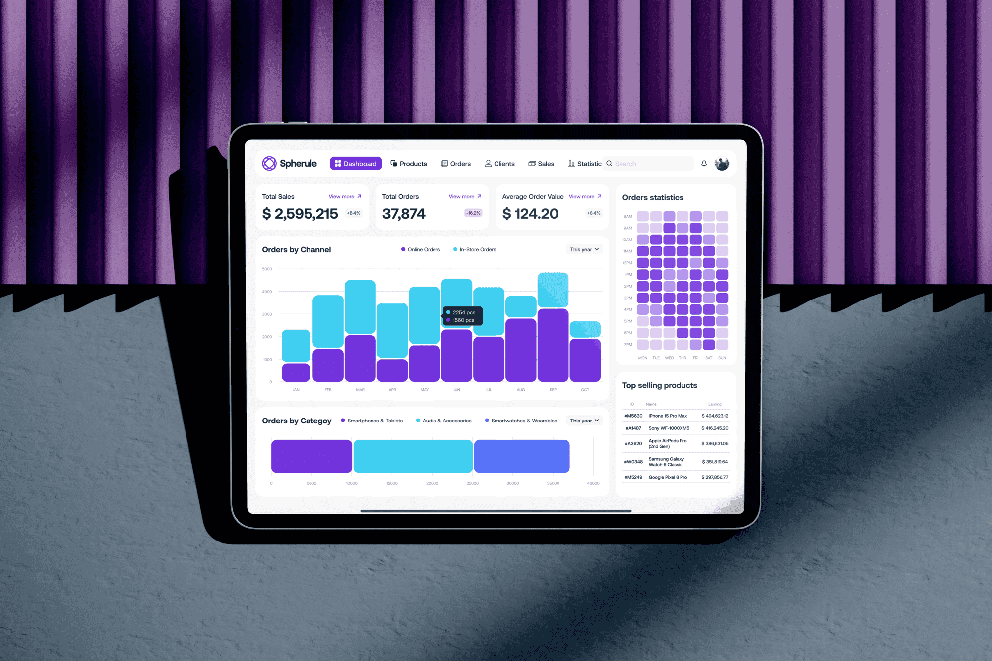
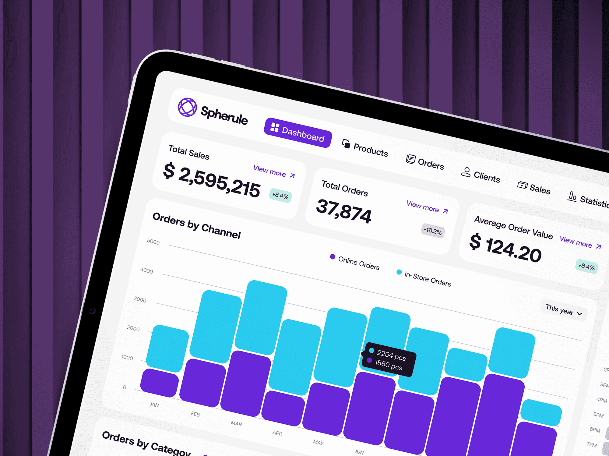
The dashboard's structure was intentionally designed for quick comprehension. I placed the most critical KPIs—Total Sales, Orders, and Average Order Value—at the very top for immediate visibility. The layout then flows logically, from high-level channel performance down to specific category and product insights. This hierarchical approach allows a user to get a quick overview first, then drill down into specifics like the order statistics heatmap, creating an efficient analytical workflow.
The dashboard's structure was intentionally designed for quick comprehension. I placed the most critical KPIs—Total Sales, Orders, and Average Order Value—at the very top for immediate visibility. The layout then flows logically, from high-level channel performance down to specific category and product insights. This hierarchical approach allows a user to get a quick overview first, then drill down into specifics like the order statistics heatmap, creating an efficient analytical workflow.
Data Visualization & UI
Data Visualization & UI
I chose a clean, modern UI with a light theme to make the data visualizations the hero. Each chart type was selected for its ability to communicate a specific insight effectively—bar charts for comparisons, and a heatmap to show order density across time.
The color palette is minimal, using blues and purples to differentiate data sets without creating visual clutter. The focus was on legibility and function, ensuring every graph and table is not just visually appealing but instantly understandable.
The Outcome
The Outcome
The result is a powerful in-house web application that empowers the e-commerce team to make fast, data-driven decisions. The dashboard successfully distills complex sales metrics into a clean, intuitive, and highly functional interface.
By prioritizing clarity and providing actionable insights at a glance, the tool moves beyond simple reporting to become a core part of the daily strategic workflow. It's a design built not just for viewing data, but for understanding and acting on it.
More Works More Works


Let'S WORK
TOGETHER
BASED IN LATIN AMERICA
COLOMBIA & EL SALVADOR

UX / UI DESIGNER
+ Design System Manager
Whether you already have a clear idea or just need help figuring things out — I’m here to bring your vision to life. Tell me about your project or book a quick call and let’s see if we’re a good fit.
Let'S WORK
TOGETHER
BASED IN LATIN AMERICA
COLOMBIA & EL SALVADOR
UX / UI DESIGNER
+ Design System Manager
Whether you already have a clear idea or just need help figuring things out — I’m here to bring your vision to life. Tell me about your project or book a quick call and let’s see if we’re a good fit.
Let'S WORK
TOGETHER
Whether you already have a clear idea or just need help figuring things out — I’m here to bring your vision to life. Tell me about your project or book a quick call and let’s see if we’re a good fit.
Let'S WORK
TOGETHER
BASED IN LATIN AMERICA
COLOMBIA & EL SALVADOR
UX / UI DESIGNER
+ Design System Manager