Galo Bank App
Mobile App Design
/
Design Systems
Galo Bank App
Mobile App Design
/
Design Systems
Galo Bank App
Mobile App Design
/
Design Systems
A mobile banking and crypto wallet app designed from scratch, integrating fiat and crypto assets in a single user-friendly experience.
A mobile banking and crypto wallet app designed from scratch, integrating fiat and crypto assets in a single user-friendly experience.
A mobile banking and crypto wallet app designed from scratch, integrating fiat and crypto assets in a single user-friendly experience.

Year
2023
Client
Galo Bank
Industry
Fintech Crypto
Product Duration
5 Weeks
Challenge
Challenge
Galo was starting from scratch. A new digital bank with no existing product, no flows, no screens — just an idea and a goal: make online banking feel simple, trustworthy, and efficient. I was in charge of shaping the full experience from zero. That meant defining the structure, the interface, and the logic to make it all work seamlessly.
Galo was starting from scratch. A new digital bank with no existing product, no flows, no screens — just an idea and a goal: make online banking feel simple, trustworthy, and efficient. I was in charge of shaping the full experience from zero. That meant defining the structure, the interface, and the logic to make it all work seamlessly.
UX Approach
UX Approach
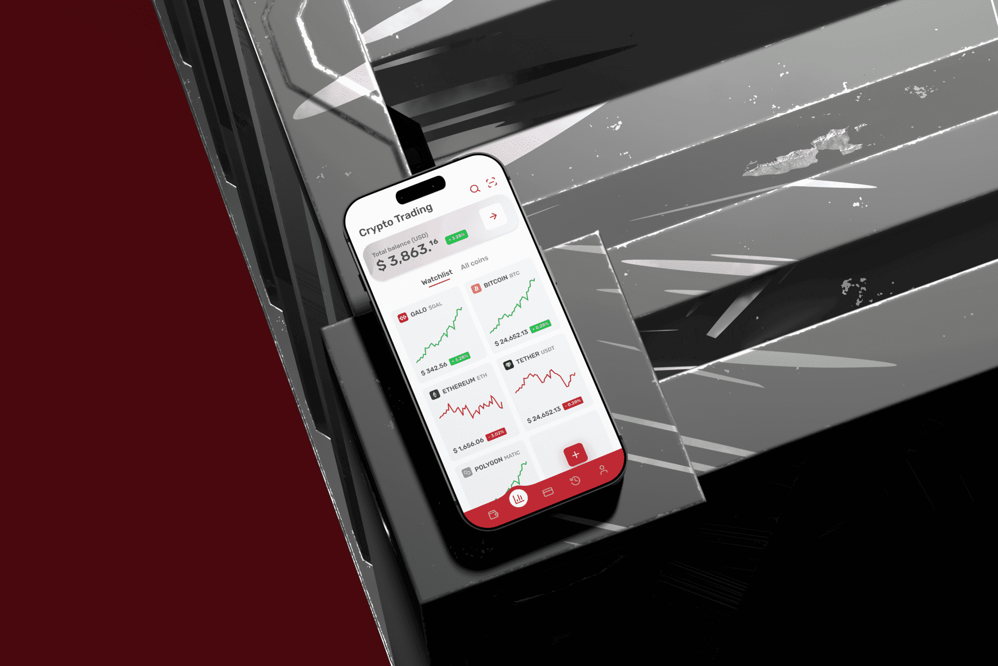
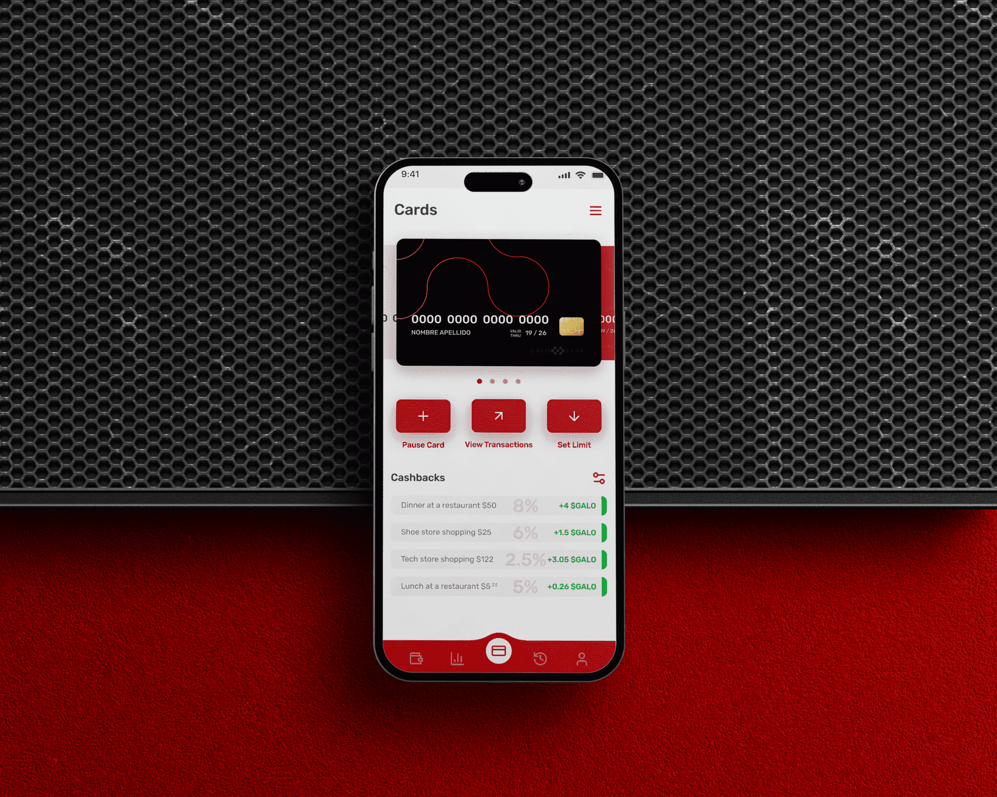
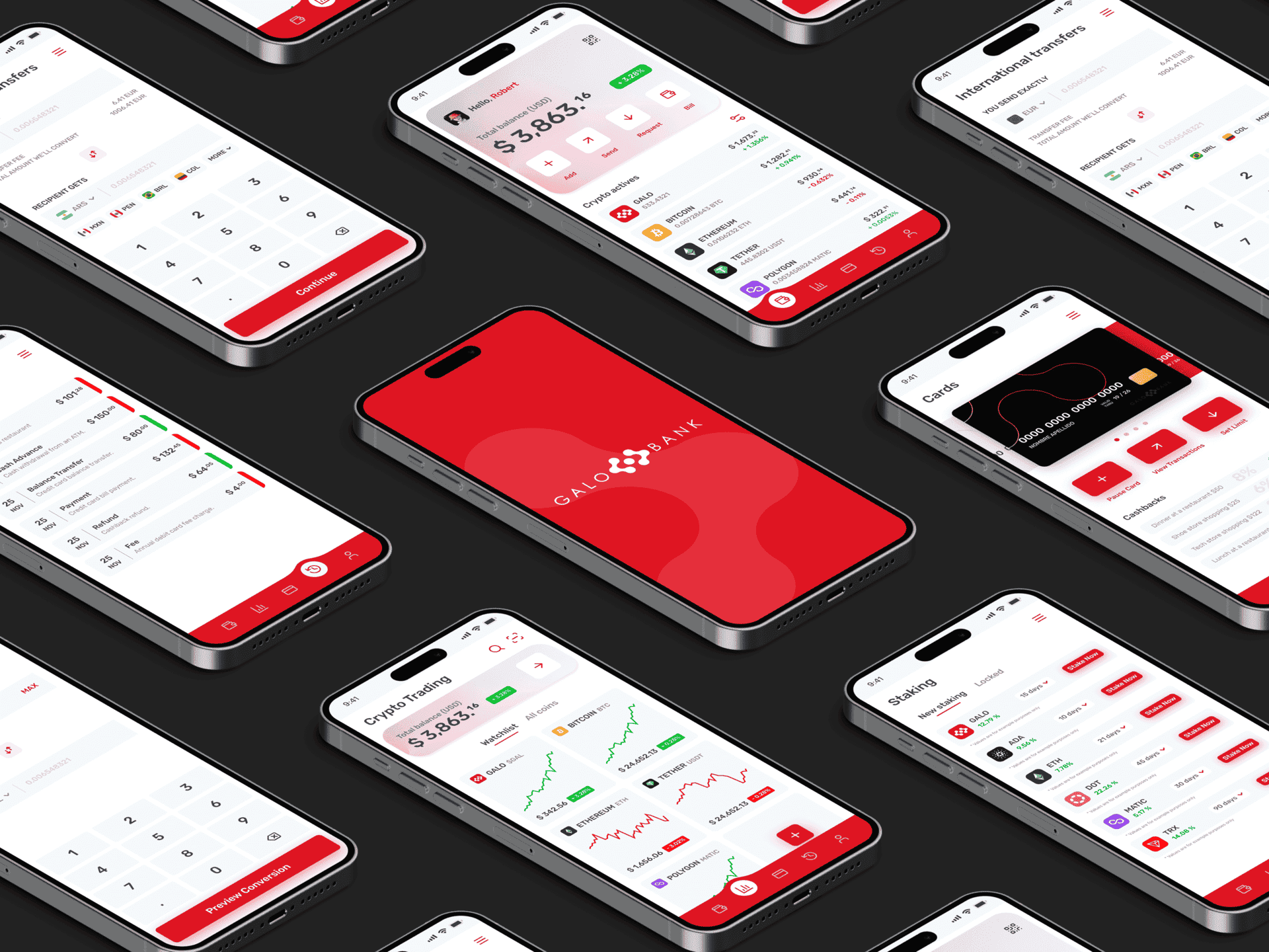
I designed the experience around real tasks: checking balance, sending and receiving crypto, reviewing transactions, accessing the digital card, and tracking cashback. The navigation followed user intentions — not assumptions.
Each flow was crafted to reduce friction, simplify decisions, and guide users with clarity. I relied on familiar patterns, generous spacing, and clean hierarchies to make everything feel intuitive from the start. The bottom navigation bar provided quick access to key features at all times.
Nothing distracts. Nothing overwhelms. Everything has a reason to be there.

UI Design
UI Design
The visual identity followed a bold but clean aesthetic: white backgrounds, sharp reds, and strong typography inspired by the client’s branding. Clear data visualization, responsive components, and consistent iconography formed the foundation of the interface.
I also designed interactive cards with animated states and real-time asset tracking, adding small moments of delight without disrupting the experience. The visuals support the product — never outshine it.
Design System Foundations
Design System Foundations
Alongside the interface, I built a scalable system of tokens, grids, and UI components. Buttons, forms, alerts, and layouts were defined with precision — ensuring every screen stayed consistent as the product grew.
I documented color logic, type scales, icon behavior, and motion principles so future teams could build confidently without reinventing the wheel. It wasn’t just about how it looked — it was about how it worked.
Take a closer look at the full project.
More Works More Works


Let'S WORK
TOGETHER
BASED IN LATIN AMERICA
COLOMBIA & EL SALVADOR
UX / UI DESIGNER
+ Design System Manager
Whether you already have a clear idea or just need help figuring things out — I’m here to bring your vision to life. Tell me about your project or book a quick call and let’s see if we’re a good fit.
Let'S WORK
TOGETHER
Whether you already have a clear idea or just need help figuring things out — I’m here to bring your vision to life. Tell me about your project or book a quick call and let’s see if we’re a good fit.
Let'S WORK
TOGETHER
BASED IN LATIN AMERICA
COLOMBIA & EL SALVADOR
UX / UI DESIGNER
+ Design System Manager