Interactive Data Map
Web Design
/
Custom Solutions
Interactive Data Map
Web Design
/
Custom Solutions
Interactive Data Map
Web Design
/
Custom Solutions
I was entrusted by the United Nations Development Programme (UNDP) to design an interactive map summarizing El Salvador's key socio-economic indicators.
I was entrusted by the United Nations Development Programme (UNDP) to design an interactive map summarizing El Salvador's key socio-economic indicators.
I was entrusted by the United Nations Development Programme (UNDP) to design an interactive map summarizing El Salvador's key socio-economic indicators.

Year
2024
Client
United Nations Development Programme (UNDP)
Industry
Data Visualization
Product Duration
3 Weeks
Challenge
Challenge
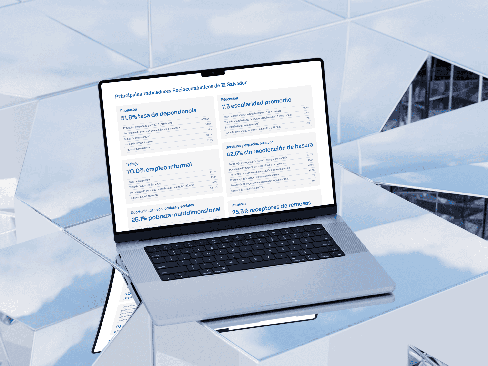
The United Nations Development Programme (UNDP) compiled a massive report on El Salvador's socio-economic indicators—a document rich with vital data but too dense for broad public consumption. My challenge was to distill this complexity.
I was tasked with transforming hundreds of data points from an extensive study into an accessible, digital format. The goal was to design a tool that could clearly communicate crucial insights about poverty, education, and public services to policymakers and citizens alike.
The Solution
The Solution
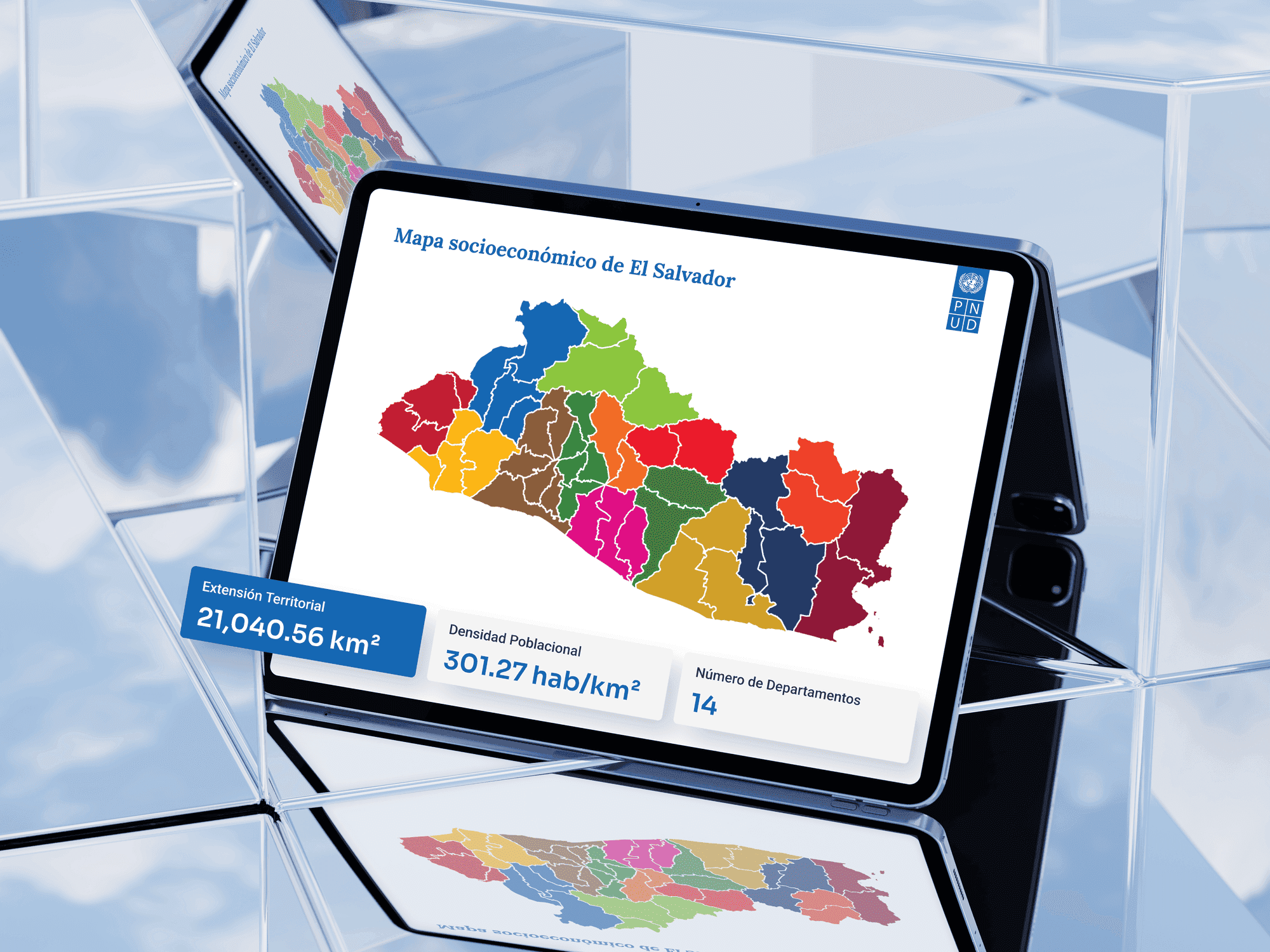
The most intuitive solution for geographically-specific data is a map. I proposed and designed a fully interactive map of El Salvador to serve as the primary interface. This approach allows users to explore complex data in a natural, engaging way. Instead of navigating dense tables, users can simply click on a municipality to access its specific indicators.
This structure transforms a static report into a dynamic tool for discovery, making the information both engaging and easier to comprehend.

Design & User Experience
Design & User Experience
The user experience was designed for ultimate clarity. The interface is clean and minimal, ensuring the map itself is the central focus. Upon clicking a municipality, a non-intrusive panel appears, presenting the key indicators in clear, digestible cards. This avoids overwhelming the user with numbers. I structured the interaction to be simple and direct, ensuring that the design serves the data, not the other way around.
The user experience was designed for ultimate clarity. The interface is clean and minimal, ensuring the map itself is the central focus. Upon clicking a municipality, a non-intrusive panel appears, presenting the key indicators in clear, digestible cards. This avoids overwhelming the user with numbers. I structured the interaction to be simple and direct, ensuring that the design serves the data, not the other way around.
The Outcome
The Outcome
The outcome is a valuable public tool that makes crucial national data accessible to everyone. Being entrusted with this project by the UNDP was a significant responsibility, and the final interactive map successfully translates their in-depth research into an engaging, easy-to-use format.
It stands as a testament to my ability to handle complex data and deliver a polished, functional product for a high-profile international organization, turning critical information into an impactful user experience.
Take a closer look at the full project.
More Works More Works


Let'S WORK
TOGETHER
BASED IN LATIN AMERICA
COLOMBIA & EL SALVADOR

UX / UI DESIGNER
+ Design System Manager
Whether you already have a clear idea or just need help figuring things out — I’m here to bring your vision to life. Tell me about your project or book a quick call and let’s see if we’re a good fit.
Let'S WORK
TOGETHER
BASED IN LATIN AMERICA
COLOMBIA & EL SALVADOR
UX / UI DESIGNER
+ Design System Manager
Whether you already have a clear idea or just need help figuring things out — I’m here to bring your vision to life. Tell me about your project or book a quick call and let’s see if we’re a good fit.
Let'S WORK
TOGETHER
Whether you already have a clear idea or just need help figuring things out — I’m here to bring your vision to life. Tell me about your project or book a quick call and let’s see if we’re a good fit.
Let'S WORK
TOGETHER
BASED IN LATIN AMERICA
COLOMBIA & EL SALVADOR
UX / UI DESIGNER
+ Design System Manager